Color Psychology in Interior Design: Choosing the Right Colours for Malaysian Homes
Colour is far more than decoration — it's a psychological tool that shapes how we feel, behave, and experience a space. Research consistently shows that colours influence mood, appetite, energy levels, and even perceived temperature. Understanding colour psychology means you can design rooms that actively support your lifestyle rather than working against it.
Key takeaways
Blue lowers heart rate and blood pressure — the most therapeutic choice for bedrooms and bathrooms.
Neutrals form the backbone of timeless interiors, especially warm tones like cream, sand, and greige in Malaysian homes.
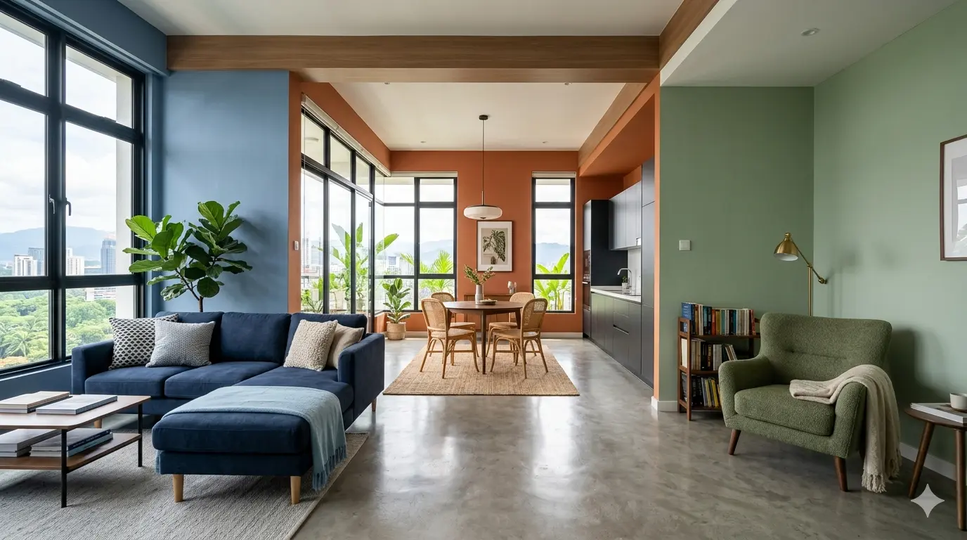
Follow the 60-30-10 rule: 60% dominant colour, 30% secondary, 10% accent — for instant visual harmony.
Always test paint samples in your actual space at different times of day before committing.
How Colours Affect Mood
Blue — calm and serenity
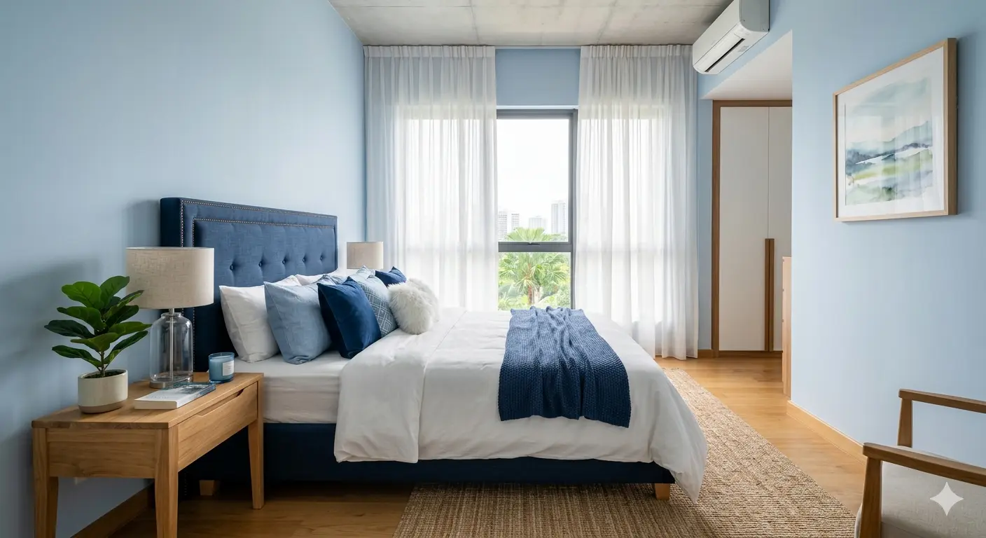
Blue evokes calm, trust, and stability — ideal for bedrooms and bathrooms where relaxation is the priority. Lighter blues like powder blue and sky blue create an airy, serene atmosphere, while deeper tones like navy and teal add sophistication and intimacy. Studies have shown that blue can actually lower heart rate and blood pressure, making it a genuinely therapeutic choice for spaces meant for unwinding.
Green — balance and nature
Green connects us to nature and represents balance, renewal, and harmony. It's the easiest colour for the human eye to process, which is why it feels so naturally restful. Sage green and olive tones bring warmth to living rooms and bedrooms, while brighter greens energise kitchens and dining areas. In Malaysian homes, where lush tropical greenery is visible from many windows, green interiors create a seamless indoor-outdoor connection.
Red — energy and appetite
Red is the most emotionally intense colour. It stimulates appetite, raises energy levels, and encourages conversation — which is why restaurants use it frequently. In residential design, red works beautifully as an accent colour in dining rooms and entertainment areas. However, red as a dominant wall colour can feel overwhelming and increase anxiety. Use it strategically through furniture, artwork, cushions, or a single feature wall.
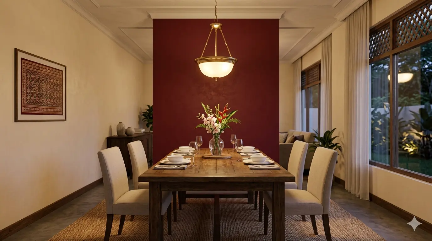
Yellow — warmth and optimism
Yellow radiates warmth, optimism, and creativity — a natural choice for kitchens, breakfast nooks, and hallways. Soft butter yellows and mustard tones add warmth without overwhelming a space. Be cautious with yellow in bedrooms — its stimulating properties can interfere with sleep. If you love yellow for your bedroom, opt for very muted, creamy tones.
Neutrals — timeless foundations
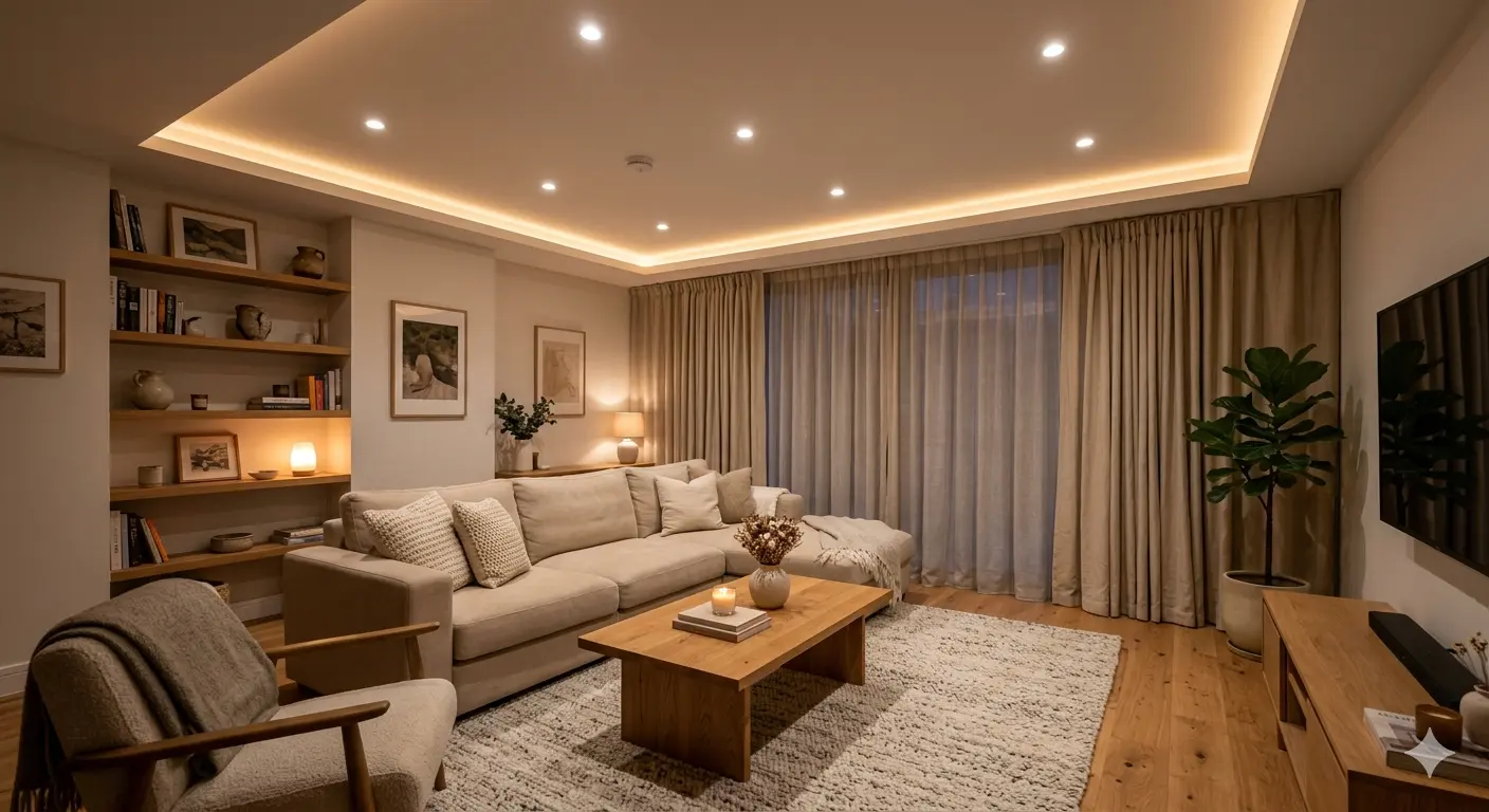
Neutral colours — whites, beiges, greys, and taupes — form the backbone of most successful interior palettes. They provide visual breathing room, let furniture and artwork take centre stage, and create a timeless foundation. In Malaysian interiors, warm neutrals like cream, sand, and greige (grey-beige) are particularly popular because they complement natural wood tones and work with both warm and cool accent colours.
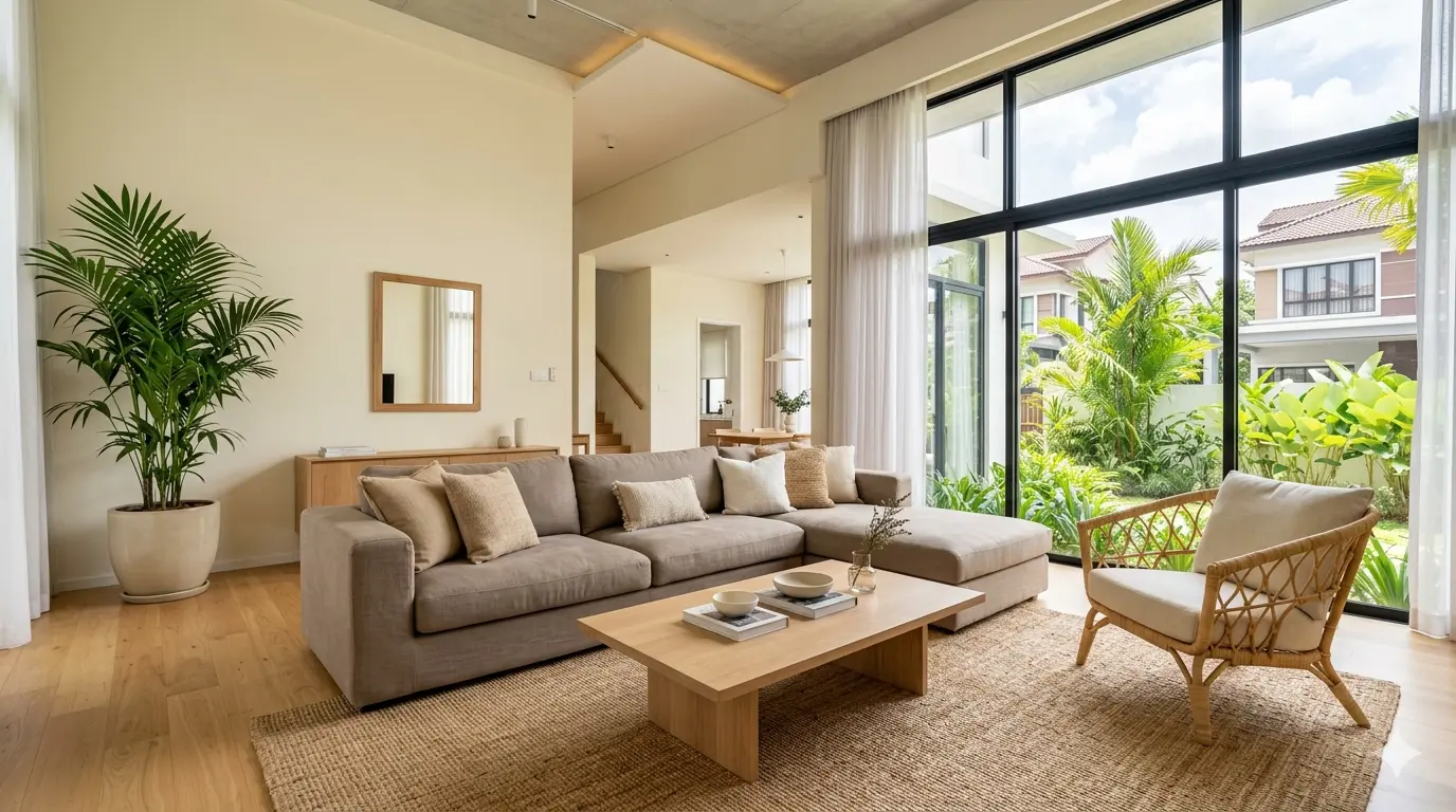
Dark colours — depth and luxury
Dark colours like charcoal, deep brown, and black can add incredible depth and luxury when used correctly. A dark accent wall in a bedroom creates a cocoon-like intimacy, while dark cabinetry with good lighting feels sophisticated and modern. The key is balance — pair dark surfaces with lighter elements and ensure adequate lighting so the space doesn't feel cave-like.
The 60-30-10 Rule
The 60-30-10 rule is a trusted formula for balanced colour schemes:
- •60% — dominant colour (walls and large furniture)
- •30% — secondary colour (upholstery, curtains, bedding)
- •10% — accent colour (cushions, artwork, decorative objects)
This ratio creates visual harmony while still allowing for personality and interest. It prevents rooms from feeling either monotonous or chaotic.
Colour and Lighting
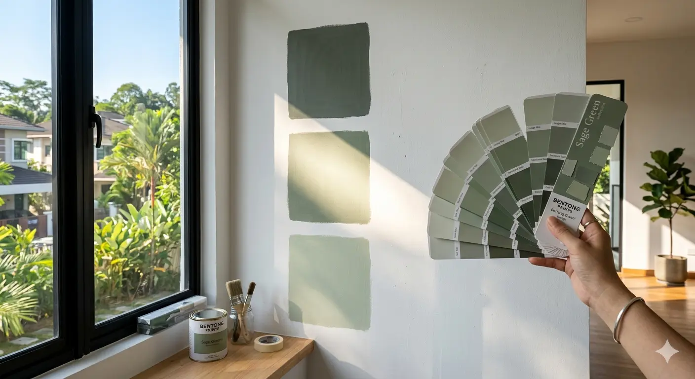
Colour perception changes dramatically under different lighting conditions. A paint swatch that looks perfect in the store can appear completely different on your wall.
- •Warm artificial light makes colours appear more yellow
- •Cool LEDs push colours toward blue
- •Morning light is cooler; afternoon light is warmer
Always test paint samples in your actual space, applying large swatches on at least two walls, and observe them at different times of day before committing.
Creating Flow Between Rooms
Consider the flow of colour throughout your entire home, not just individual rooms. Adjacent spaces should share colour relationships that create a cohesive journey. This doesn't mean every room must be the same colour — rather, there should be connecting threads. If your living room is warm grey, the adjoining dining room might pick up that warmth through complementary tones. Abrupt colour shifts between connected spaces feel jarring.
Cultural Considerations in Malaysia
In Malaysian and broader Asian contexts, colour carries cultural significance:
- •Red symbolises prosperity and good fortune
- •Gold represents wealth and abundance
- •White is associated with mourning in some traditions
While personal preference should ultimately guide your choices, being mindful of cultural context — especially if you frequently host guests from diverse backgrounds — adds a thoughtful layer to your design decisions.
Choosing Your Palette
The best colour palette resonates with you personally and supports how you actually live. Trends come and go, but your emotional response to colour is deeply individual. Start with colours that make you feel good, test them thoroughly in your space, and build your palette with intentional layering. A well-chosen colour scheme doesn't just look beautiful — it makes your home feel like a place where you genuinely want to spend time.
Looking for an interior designer near you?
OutBox Design serves homeowners across the Klang Valley with full design-and-build services.